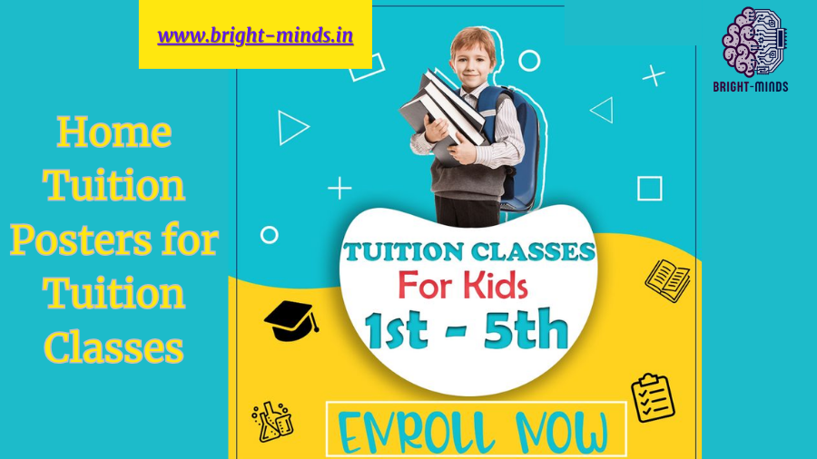
Designing Effective Home tuition posters for tuition classes to Attract Students As a tuition provider, having a well-designed poster is crucial for promoting your classes and attracting potential students.
A good poster should be eye-catching, informative, and convey the key benefits of your tuition services. In this blog post, we’ll explore some tips and best practices for creating home tuition posters that get results.
1. Clearly State Your Tuition Offerings
Make sure your poster clearly states the subjects, grades, and age groups you cater to. Use bold, legible fonts to highlight this information prominently. If you offer specialized courses like exam preparation or enrichment programs, mention them as well.
2. Highlight Your Unique Selling Points
What sets your tuition classes apart from others? Is it your experienced faculty, personalized attention, or proven track record of student success? Emphasize these unique selling points on your poster to make a strong impression.
3. Use High-Quality Images
Incorporate relevant, high-quality images on your poster to make it visually appealing. These could be photos of your teaching staff, classroom settings, or even successful students. Avoid using low-resolution or stock images that look generic.
How can I create eye-catching posters for tuition classes
1. Clearly State Your Tuition Offerings
- Subject and Grade Range: Mention the subjects you teach and the grade levels you cater to.
- Specialized Courses: Highlight any specialized courses you offer, such as exam preparation or enrichment programs.
2. Highlight Your Unique Selling Points
Proven Track Record: Highlight any notable achievements or success stories of your students.
Experienced Faculty: Emphasize the qualifications and experience of your teaching staff.
Personalized Attention: Mention the personalized attention and small class sizes you provide.
What are some creative ways to use graphics in tuition posters
Here are some creative ways to use graphics in tuition posters:
Classroom Scenes: Use photographs or illustrations of your actual classroom settings to give prospective students a sense of the learning environment you provide.
llustrative Graphics: Use hand-drawn or digital illustrations to visually represent the subjects you teach, the age groups you cater to, or the learning environment. This can make the poster more engaging and memorable.
Infographic Elements: Incorporate infographic-style elements like icons, charts, or data visualizations to highlight key information about your tuition classes, such as student-teacher ratios, exam results, or areas of expertise.
Student Testimonials: Include headshots or illustrations of your successful students along with short testimonials about their experience in your classes. This can help build trust and credibility.
Conclusion:
Elevate Your Tuition Posters with Captivating Graphics. In the competitive world of tuition services, creating eye-catching and informative posters is crucial for attracting potential students and showcasing the unique value of your classes. By incorporating a variety of creative graphics, you can elevate your tuition posters and make a lasting impression on your target audience.From illustrative graphics and infographic elements to student testimonials and interactive features, the possibilities are endless when it comes to leveraging visuals to enhance your tuition posters. By aligning these graphics with your brand identity and the specific subjects and services you offer, you can craft a cohesive and compelling marketing material that resonates with prospective students and their families.
you may be interested in this blog here:-

